Version 1.1 of the definition has been released. Please help updating it, contribute translations, and help us with the design of logos and buttons to identify free cultural works and licenses!
Logo contest: Difference between revisions
Dan Lockton (talk | contribs) Adding my logos + text |
|||
| Line 186: | Line 186: | ||
The simple 'f' in a circle illustrates free content and perhaps the movement generally; the flower version explicitly emphasises freedom of expression. The colours are only a suggestion! --[[User:Dan Lockton|Dan Lockton]] 18:34, 2 September 2006 (CEST) | The simple 'f' in a circle illustrates free content and perhaps the movement generally; the flower version explicitly emphasises freedom of expression. The colours are only a suggestion! --[[User:Dan Lockton|Dan Lockton]] 18:34, 2 September 2006 (CEST) | ||
:Nice work, I like the simple flower-outline black & white form (the right-hand one). | |||
:Please note, by the way, that the "Free Expression" term has been [[Talk:Definition/Unstable#Pushing_to_1.0|dropped]] because it was too ambiguous, so we only need a "Free Content" logo. I'll update the contest description to reflect this. | |||
:--[[User:Antoine|Antoine]] 23:35, 2 September 2006 (CEST) | |||
Revision as of 21:35, 2 September 2006
We need two separate logos, a "Free Content" logo and a "Free Expression" logo, that can be attached to works covered by licenses which meet the conditions defined in the Free Content and Expression Definition. Each of these logos should consist of:
- a symbol or sign that is the same for both logos (minor variations allowed)
- a label, i.e. "Free Content" or "Free Expression"
Logos must have a vector graphics source (SVG preferred), but must be uploaded in a bitmap format (transparent PNG preferred). A good, free software vector graphics application which can handle SVG and PNG exports is inkscape. The dimensions are up to you as long as the images scale well. In order for your logo to be used, the logo itself must be free content with a reduced attribution requirement, but we can work this out with you once we have picked your logo.
To participate, create an account and upload your logos. A deadline will be announced once we have a better feel for how many submissions to expect. The moderators act as a jury.
Why participate? Your logo may end up being used on millions of works large and small, giving you exposition and recognition. You will be fully acknowledged on this website as the artist. We may also announce prizes during the course of the contest.
Some advice and ideas:
- Don't make it too complex. See the Wikipedia article logo for some information on what makes a good logo.
- Since "Free Expression" is meant to be used primarily for artistic works, it may be a good idea to make this particular logo slightly more playful.
- It's all about works being used freely, merged, copied, changed, and so on. A visual metaphor that reflects this may make the most sense.
If you are confused by the wiki process, feel free to e-mail Erik at moeller AT scireview DOT de, and he will take care of things.
New Creative Commons Logos
Please, have a look at new logos proposed for CC. They are not official CC logos (yet) but may be in a future JaroslawLipszyc 14:59, 8 June 2006 (CEST)
Current submissions
Swirly
"Swirly" by Erik Möller, color & b&w, available as SVG. I'm using the text "free culture" for now as a placeholder until we've decided on a final name for the definition. This probably has similarities to lots of existing logos due to its simplicity, but I feel that freedom is best defined visually through simple forms and shapes. The blue and green represent Sky and Earth, respectively, to indicate that this is a global movement; the open shapes are somewhat informed by the copyright "C", which is, in a way, subverted to express fluidity and constant change. The soft pink subtitle is meant to complete the three primary colors, red, green and blue, from which all other colors can be additively created. The shapes are also meant to be somewhat reminiscent of a bass clef.--Erik Möller 18:15, 4 May 2006 (CEST)
- I like this design, but it doesn't work in small sizes.
- True. Could be made to work by making it a bit bolder, though I do prefer Marc's design below to my own.--Erik Möller 00:09, 25 July 2006 (CEST)
Yin Yang
"Yin Yang" by Bernhard Schillo. The shape of the logo is one half of the yin and yang symbol. I believe, this is a good basis for this logo, cause it symbolizes contradictions, which generate reality. In this case the "C" (for Culture) coexists with the "uncultured" nature. Or another possible connotation: free culture and not free culture. Human culture of property can't exist without the "seed" of free culture contained in itself and without a strong free culture on the opposition. The forces have to work together. The Logo also reminds to the Copyright-Logo. But the circle around the "C" is not a circle. The shape indicates, that something is given back.
The logo should be elaborated if used. These are just my first ideas and drafts. I will think about it again when the discussion about the name is finished. And i hope, my english is understandable :)
Free Content Logo


Marc Falzon's logo

Here is another logo proposal to illustrate the Free content idea : I made it with Inkscape, so the SVG source file is available.
The rings - using the universal colors of the rainbow - represent some pieces of content (free content illustrated by the "open" part) intertwined. For the label, I also provide some alternative fonts : the jury is free to choose another one in this list to replace the original font.
A "wiki logo" size version of my logo : 
Then a "browser-icon" size, for use as favicon : ![]()
...hope you'll like it ! :-)
- I love it! This is definitely the nicest one so far. From the fonts, I think I prefer the third one from the top. However, we should make sure that the fonts we use are available under free licenses. Could you do a grayscale version of the logo part so we know if it's suitable for print?--Erik Möller 00:08, 25 July 2006 (CEST)
This logo is not original.
Beautiful. It remembers to me pac-man:
 --Telemaco 19:24, 2 August 2006 (CEST)
Free Expression
This is a rough draft of an idea for a 'freedom of expression' logo by Mark Clements (registered as HappyDog). A better paint-palette shape would be nice, and maybe a photographic image rather than the basic vector image I have used here. In fact, having said that I uploaded a quick mock-up with a photographic 'cloud' image. Not great, but any image could be used if this was thought to be a good direction to go in. --Mark Clements (HappyDog) 02:35, 6 July 2006 (CEST)
- This is pretty, though perhaps a little too strong visually. I'd prefer something more abstract which can be used equally well for art, music, scientific data, encyclopedic articles, and so on.--Erik Möller
- I like the "yin yang" proposal above very much. Perhaps it is a little too naked right now, but it can probably be elaborated upon by a skilled person (perhaps the author himself) ;-)) I think the basic graphical concept is simple, clear and rather adequate. --Antoine 16:12, 14 July 2006 (CEST)
Telemaco's Logos


Butterfly FC. Black over white and white over black. No problem in gray scale. Very good over t-shirt. Simple and elegant.
Copyleft
This is a draft I did earlier this year. For more information on the design see http://haag.openkhm.de/132

From copyright to copyleft

I marked the compliances in Free Content and Free Expression (ee) and took the resulting sign.

FKey
Start for this design was to break up the circle of usual copyright-sign via a F like freedom
I took the resulting form that resembles a key
C for the Free Content Mark, X for Free Expression and the empty one for a general Freedom Defined logo
All logos can be combined with type...
... and should also work in icon size
Dan Lockton's logos
My starting point is the observation that since the (C) mark is so universally known, the freedom marks ultimately need to be equally so. The (C) mark is also very easy for anyone to draw by hand and thus add to their work at the time of creation - again, the freedom mark needs to be equally easy to draw by hand (with distinct features which are memorable and recognisable even if imperfectly reproduced).
It may be 'boring' but it would seem that an F in a circle fulfils these requirements well - but it is rather dull. There are also a number of company logos using a lower-case script f in a circle, and this could cause confusion. So, initially, I tried some stylised letter fs in a circle:
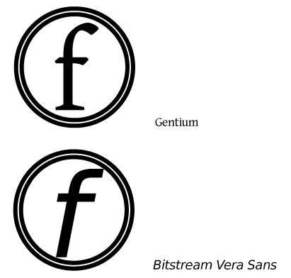
These still look rather corporate and not especially 'friendly'. Lower-case text is often perceived as friendlier and less authoritarian than capital letters, and actual fonts rather than heavily stylised letters also help give a more human feel to the logo. So I looked at a couple of the best-known Free/Open Source fonts, Gentium and Bitstream Vera Sans and played with the lower-case f from these fonts:
The logo using Bitstream looks more 'modern'/futuristic than the Gentium one, especially when matched with suitably dynamic, friendly colours:
However, given the strong literary component of the free culture movement, the serifed, more 'classic' Gentium f somehow seems more appropriate:
To distinguish between 'free content' and 'free expression', as mentioned in the intro to the contest, I considered simply using a warmer, more 'passionate' colour:
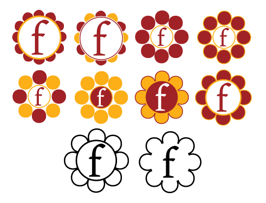
But it seemed as though something more was needed: a more distinctive, genuinely playful extension of the logo. Hence, the "Flowering of Creativity" concept developed:
There are many metaphors which work well when comparing free expression and free culture to a flower:
- Free culture will lead to an enormous flowering of creativity around the world, a blossoming of rich content
- The multiplicity of petals symbolises the many people and groups around the world who together make up the value of the freedom movement
- The flower is open, just as works available freely are open to all
- The 'garden' of free culture is a fertile one: so many projects and works can grow from the work of others - pretty much the purpose of the GPL
Lastly - note the black & white versions of the flower logo: easy to draw quickly by hand (particularly the right-hand one) to add to any document, artwork, etc to show it's being freely licensed. The variations in how the flower is drawn, from exaggeratedly bubbly petals to precisely geometric, again demonstrate the diversity of the free culture movement, and will allow a playful personality to be injected with every hand drawing of the logo - truly free expression! The logo itself becomes a triumphant doodle symbolising peaceful rejection of the copyright hegemony.
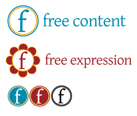
Finally, then, these are my favoured versions of the logos:
The simple 'f' in a circle illustrates free content and perhaps the movement generally; the flower version explicitly emphasises freedom of expression. The colours are only a suggestion! --Dan Lockton 18:34, 2 September 2006 (CEST)
- Nice work, I like the simple flower-outline black & white form (the right-hand one).
- Please note, by the way, that the "Free Expression" term has been dropped because it was too ambiguous, so we only need a "Free Content" logo. I'll update the contest description to reflect this.
- --Antoine 23:35, 2 September 2006 (CEST)
