Version 1.1 of the definition has been released. Please help updating it, contribute translations, and help us with the design of logos and buttons to identify free cultural works and licenses!
Logo contest: Difference between revisions
m Reverted edits by 105.232.255.53 (talk) to last revision by Mormegil Tag: Rollback |
|||
| (12 intermediate revisions by 8 users not shown) | |||
| Line 88: | Line 88: | ||
::I like the "yin yang" proposal above very much. Perhaps it is a little too naked right now, but it can probably be elaborated upon by a skilled person (perhaps the author himself) ;-)) I think the basic graphical concept is simple, clear and rather adequate. --[[User:Antoine|Antoine]] 16:12, 14 July 2006 (CEST) | ::I like the "yin yang" proposal above very much. Perhaps it is a little too naked right now, but it can probably be elaborated upon by a skilled person (perhaps the author himself) ;-)) I think the basic graphical concept is simple, clear and rather adequate. --[[User:Antoine|Antoine]] 16:12, 14 July 2006 (CEST) | ||
== Telemaco's Logos == | == Telemaco's Logos == | ||
| Line 115: | Line 113: | ||
[[Image:Freekey_fc.gif]] | [[Image:Freekey_fc.gif]] | ||
== Libre == | == Libre == | ||
Latest revision as of 09:54, 26 July 2023
We need a "Free Content" logo that can be attached to works covered by licenses which meet the conditions defined in the Free Content Definition. This logo should consist of:
- a symbol or sign that is the same for both logos (minor variations allowed)
- a label, probably "Free Content"
Logos must have a vector graphics source (SVG preferred), but must be uploaded in a bitmap format (transparent PNG preferred). A good, free software vector graphics application which can handle SVG and PNG exports is inkscape. The dimensions are up to you as long as the images scale well. In order for your logo to be used, the logo itself must be free content with a reduced attribution requirement, but we can work this out with you once we have picked your logo.
To participate, create an account and upload your logos. A deadline will be announced once we have a better feel for how many submissions to expect. The moderators act as a jury.
Why participate? Your logo may end up being used on millions of works large and small, giving you exposition and recognition. You will be fully acknowledged on this website as the artist. We may also announce prizes during the course of the contest.
Some advice and ideas:
- Don't make it too complex. See the Wikipedia article logo for some information on what makes a good logo.
- It's all about works being used freely, merged, copied, changed, and so on. A visual metaphor that reflects this may make the most sense.
If you are confused by the wiki process, feel free to e-mail Erik at moeller AT scireview DOT de, and he will take care of things.
Please note: it was recently decided to drop the term "Free Expression" because it was too ambiguous in our context. Thus, we don't need two different logos anymore, only a "Free Content" logo.
New Creative Commons Logos[edit]
Please, have a look at new logos proposed for CC. They are not official CC logos (yet) but may be in a future JaroslawLipszyc 14:59, 8 June 2006 (CEST)
Current submissions[edit]
respectively, to indicate that this is a global movement; the open shapes are somewhat informed by the copyright "C", which is, in a way, subverted to express fluidity and constant change.
- I like this design, but it doesn't work in small sizes.
- True. Could be made to work by making it a bit bolder, though I do prefer Marc's design below to my own.--Erik Möller 00:09, 25 July 2006 (CEST)
- How about a mix of the swirly into "Libre" below? (i.e. instead of the butterfly) [http://freedomdefined.org/User
Yin Yang[edit]
"Yin Yang" by Bernhard Schillo. The shape of the logo is one half of the yin and yang symbol. I believe, this is a good basis for this logo, cause it symbolizes contradictions, which generate reality. In this case the "C" (for Culture) coexists with the "uncultured" nature. Or another possible connotation: free culture and not free culture. Human culture of property can't exist without the "seed" of free culture contained in itself and without a strong free culture on the opposition. The forces have to work together. The Logo also reminds to the Copyright-Logo. But the circle around the "C" is not a circle. The shape indicates, that something is given back.
The logo should be elaborated if used. These are just my first ideas and drafts. I will think about it again when the discussion about the name is finished. And i hope, my english is understandable :)
Free Content Logo[edit]


Marc Falzon's logo[edit]

Here is another logo proposal to illustrate the Free content idea : I made it with Inkscape, so the SVG source file is available.
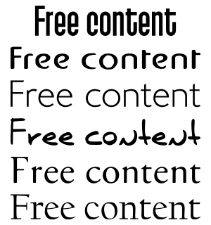
The rings - using the universal colors of the rainbow - represent some pieces of content (free content illustrated by the "open" part) intertwined. For the label, I also provide some alternative fonts : the jury is free to choose another one in this list to replace the original font.
A "wiki logo" size version of my logo : 
Then a "browser-icon" size, for use as favicon : ![]()
...hope you'll like it ! :-)
- I love it! This is definitely the nicest one so far. From the fonts, I think I prefer the third one from the top. However, we should make sure that the fonts we use are available under free licenses. Could you do a grayscale version of the logo part so we know if it's suitable for print?--Erik Möller 00:08, 25 July 2006 (CEST)
This logo is not original.
Beautiful. It remembers to me pac-man:
 --Telemaco 19:24, 2 August 2006 (CEST)
Free Expression[edit]
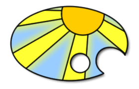
This is a rough draft of an idea for a 'freedom of expression' logo by Mark Clements (registered as HappyDog). A better paint-palette shape would be nice, and maybe a photographic image rather than the basic vector image I have used here. In fact, having said that I uploaded a quick mock-up with a photographic 'cloud' image. Not great, but any image could be used if this was thought to be a good direction to go in. --Mark Clements (HappyDog) 02:35, 6 July 2006 (CEST)
- This is pretty, though perhaps a little too strong visually. I'd prefer something more abstract which can be used equally well for art, music, scientific data, encyclopedic articles, and so on.--Erik Möller
- I like the "yin yang" proposal above very much. Perhaps it is a little too naked right now, but it can probably be elaborated upon by a skilled person (perhaps the author himself) ;-)) I think the basic graphical concept is simple, clear and rather adequate. --Antoine 16:12, 14 July 2006 (CEST)
Telemaco's Logos[edit]


Butterfly FC. Black over white and white over black. No problem in gray scale. Very good over t-shirt. Simple and elegant.
Copyleft[edit]
This is a draft I did earlier this year. For more information on the design see

FKey[edit]
Start for this design was to break up the circle of usual copyright-sign via freedom
Libre[edit]
Invitation to artists: add "Libre" logos/emblems to this page. Note: the proposed change from "Free" to "Libre" to disambiguate "free". Libre can apply to free/libre culture, free/libre knowledge, free/libre software, etc. - or in fact any libre resources.
Also, feel free to contribute/discuss alternative language versions (e.g. 自由, etc.).
Links:
Great work everyone :-).
Kim
